VENTURA COAST BREW CO.
PACKAGE DESIGN. PRODUCT DESIGN.
Drink beer. Be happy.
Ventura, California is home to a thriving cultural scene, historic downtown, and almost a dozen microbreweries, one of those being Ventura Coast Brewing Company. VCBC was created to help promote the craft beer culture in Ventura County. By focusing on high quality yet approachable beer styles, and experimenting with specialty ingredients, VCBC is able to appeal to craft beer novices and experts alike.
Deeply rooted in Ventura, we are dedicated to the pursuit of the highest quality beer, and believe that it is best enjoyed with friends. Drink beer. Be happy.
Getting started.
Working with Kyle, Phil, Priya, and the rest of the crew at VCBC was a really wonderful experience. I had the opportunity to design VCBC’s Vendelo, their classic Mexican Lager. This design has made its way onto 650 cases (15,600 cans) and can be found across 40 locations in California including Ralph’s and BevMo!
For the can design itself, the team gravitated towards classic Americana designs that were simplistic yet bold. Some visual inspiration included Hamm’s, Budweiser, Coors, and, of course, Modelo.
THINGS I KEPT IN MIND -
Overly detailed cans end up getting lost on the shelf
Overusing contrasting colors can hinder legibility
Monochromatic designs ensure legibility
THINGS I FOCUSED ON -
A primarily gold can with white, blue, or red accents
Imagery evoking a coat of arms with a pelican instead of the typical lion or eagle
I worked through quite a few different explorations and variations throughout my process to come up with the perfect design for VCBC’s Vendelo.
The final design.
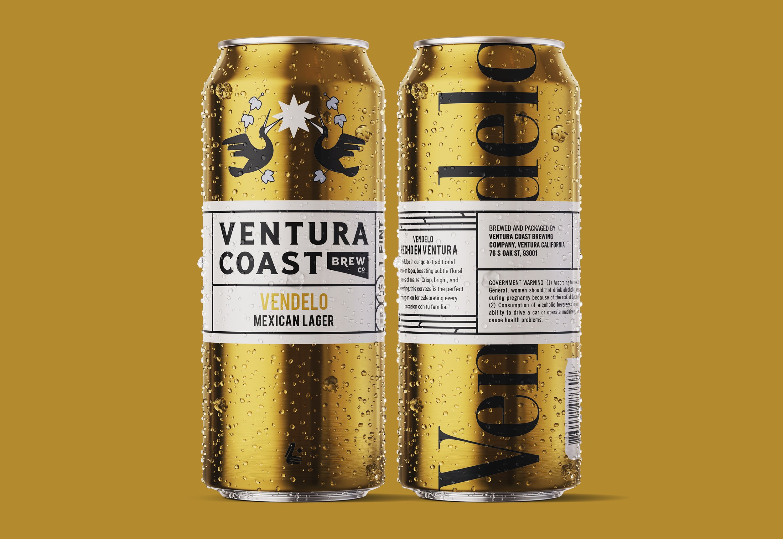
Three words I’d use to describe this final can design are: bold, iconic, and memorable.
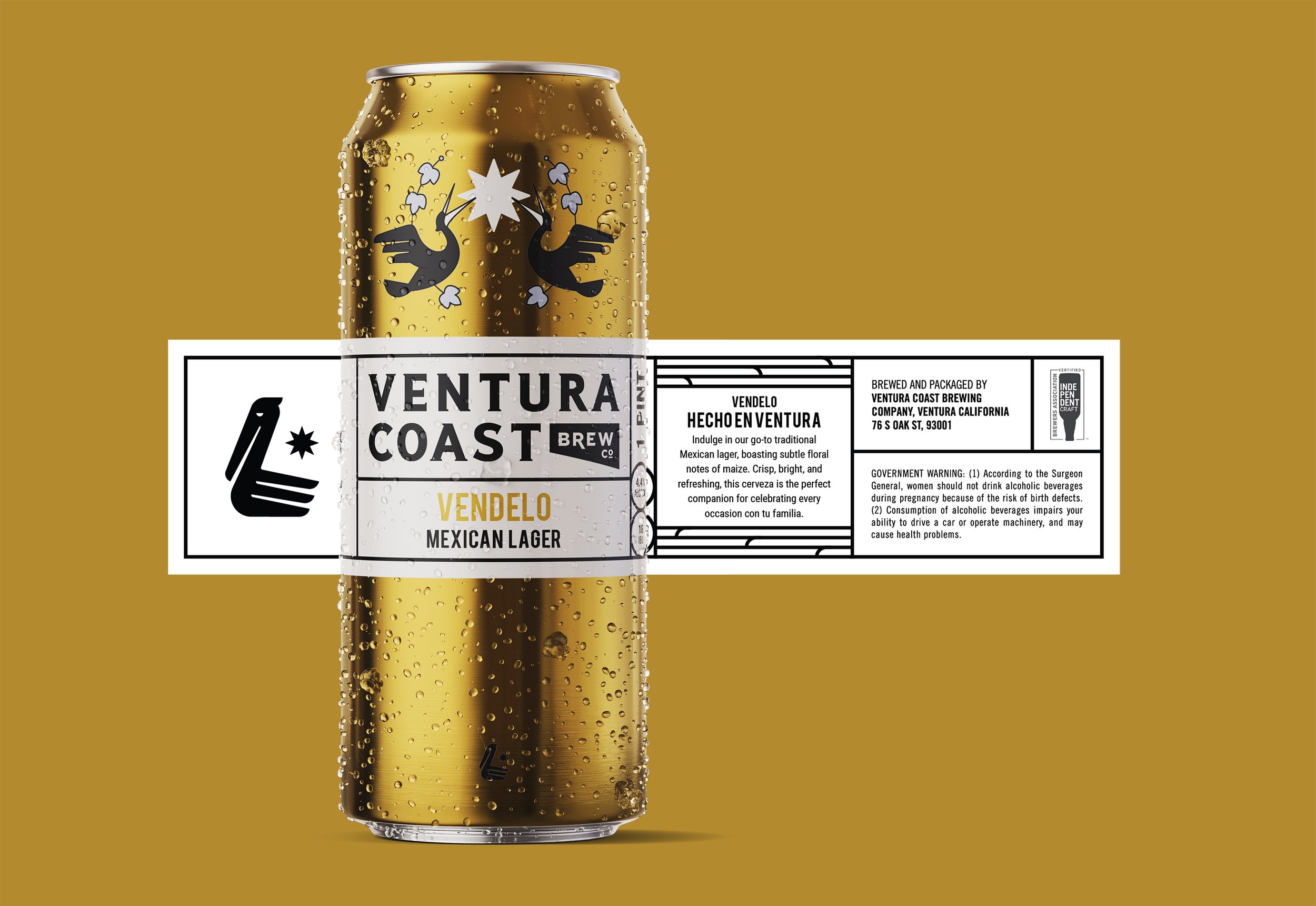
The front of the can shows a coat of arms which is made up of a hop wreath, sun, and pelicans. The hop leaves are included for obvious reason, a nod to the ingredients within the lager. The pelicans took heavy influence from the VCBC logo, providing an iconic mascot for the crest. The sun was also pulled from the VCBC logo and was used here as a background element to ground the coat of arms and really tie things together.
I added large Vendelo text to the back of the can. This added bold, visual interest to the back without taking away from the simplicity of the front which balanced the can design overall.
A crisp, clean, beautiful beer like Vendelo deserves a can of equal caliber. We reached out to @allisonspiegsss to design a new can for our classic Mexican Lager and she did not disappoint! Look for these gold cans on your local shelves when you need a refreshing addition to your day.
A deeper dive.
I want to call out a couple design elements that really made the coat of arms the star of the show.
I simplified the coat of arms immensely by focusing on iconic details, influenced by the VCBC logo, while simultaneously making the design more legible. I pulled inspiration from this logo by:
adding the sun in as a background element to balance the coat of arms overall and tie things together
simplifying the pelicans by mirroring the VCBC logo, concentrating on the feathers (on the head, wings, and tail), streamlining the beak, and removing the eye
Cheers.
If you’re in California, go check out Ventura Coast Brewing Company. And while you’re there, don’t forget to…
“Indulge in our go-to traditional Mexican lager, boasting subtle floral notes of maize. Crisp, bright, and refreshing, this cerveza is the perfect companion for celebrating every occasion con tu familia.”


