

LAURUS CANDLE CO.
BRANDING. PACKAGE DESIGN. PRODUCT DESIGN.
A retro-inspired candle company for badass women.
As more time passes, historians have increasingly portrayed the 1970s as a keystone of change. There were economic revolutions, social progression, and an increase in economic liberty of women. This era inspired my notional candle company: Laurus. Bay laurel, or Laurus, is an aromatic evergreen tree; also the origin for the name “Laurel,” a popular name in the late 70s. Laurus Candle Company provides natural and retro-inspired candles to the world.

The audience.
For relaxation lovers who want to bask in the subtle glow of candle light, Laurus Candle Co. provides retro-inspired products you’ll love. Laurus is sophisticated yet has a handmade feel with an apothecary aesthetic. Powerful, strong women who enjoy treating themselves will be obsessed with Laurus. They’re perfect for a lady who might spend a lovely Thursday evening in a bubble bath with a candle flickering close by and her favorite Fleetwood Mac vinyl softly playing in the background.


The brand.
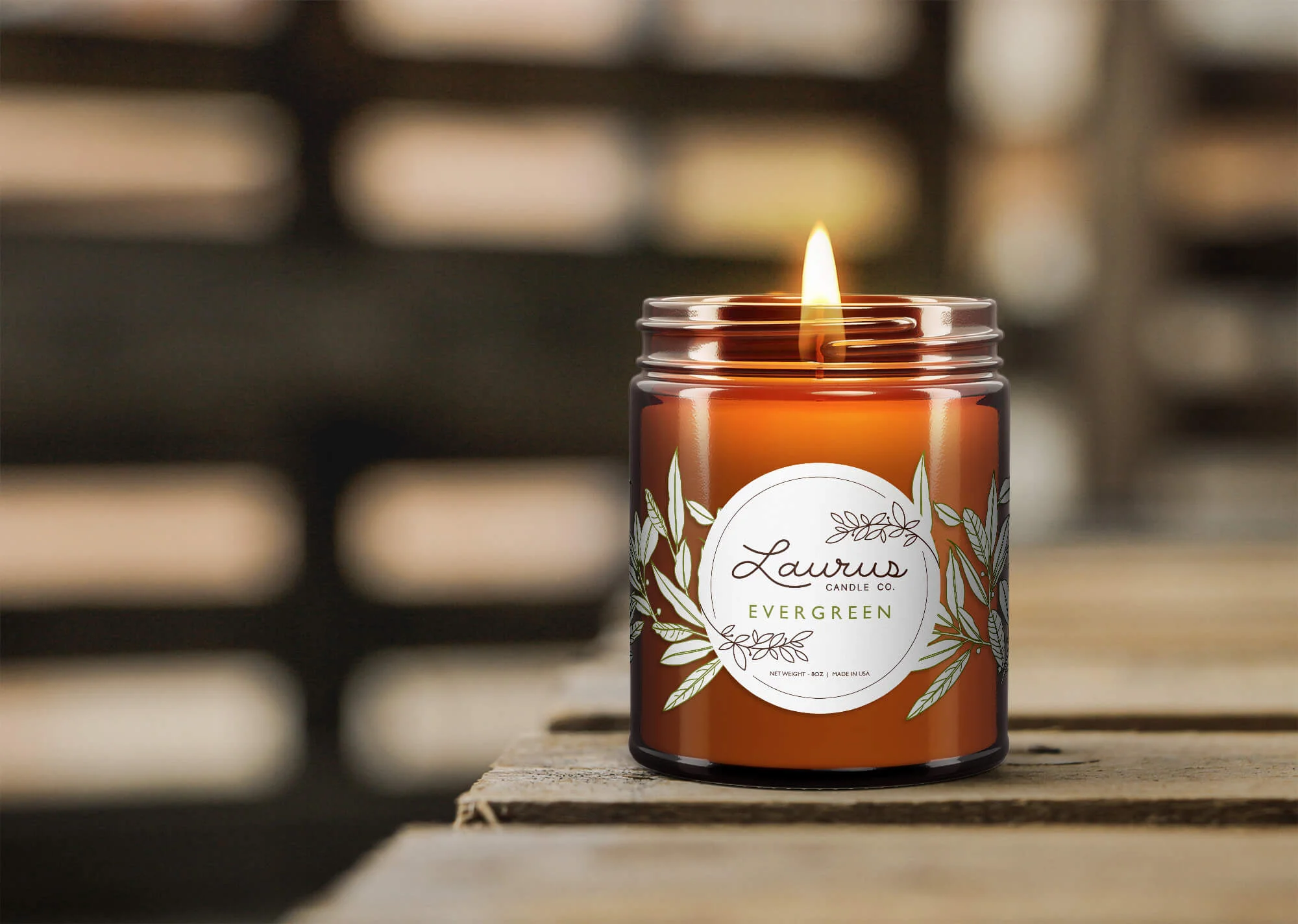
A few rad adjective that describe Laurus are vintage, suave, and natural. I brought the “handmade” feel into the brand through the hand drawn logo type and label patterns.

VINTAGE. SUAVE. NATURAL.
Each label design is similar, varying slightly by color. SAGE is a unique teal, EVERGREEN is a warm, earthy green, and DAWN is combination of red and orange, similar to a burning dawn sky. This color palette was inspired by the 70s.


